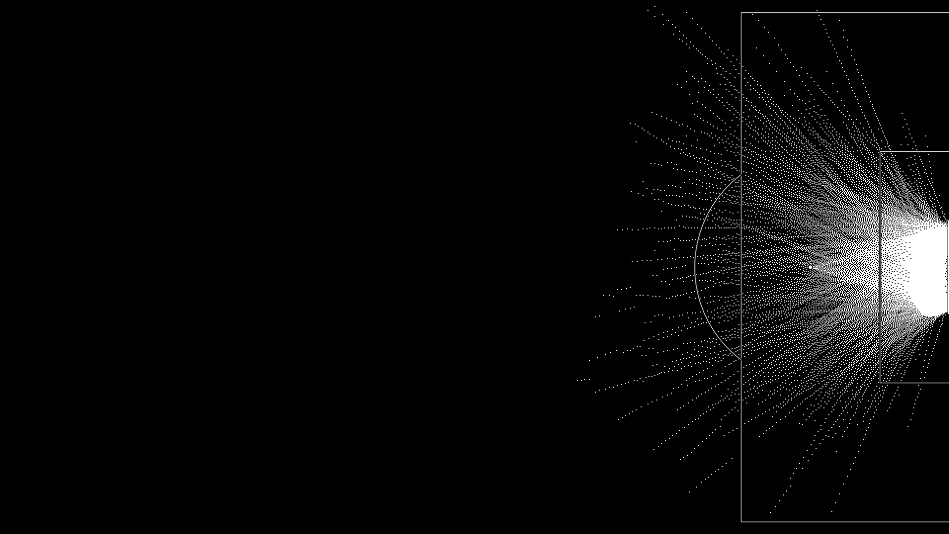
I went looking for the numbers behind the World Cup commentary, found StatsBomb's open data, and spent a few weeks poking around in it. Here is what's in there, what you can actually measure, and what I want to test next.
I watched a lot of football this summer. Somewhere around the third time a commentator said a team "controlled the game without the ball," I started wondering where any of these numbers come from. Expected goals, PPDA, progressive passes — pundits throw them around like they're readings off a dial. Is there actually a dial? Can I look at it?
Turns out: sort of. StatsBomb publishes a chunk of their event data for free on GitHub, with documentation and no login. I pulled it down expecting a toy sample. Instead I got whole seasons.
So of course I had some agents load it into DuckDB and started poking around.
The download gave me 444 matches from two competitions.
The Premier League 2015/16 season has all 380 matches as event data. Every pass, shot, pressure, lineup, and substitution, logged with coordinates and outcomes — 368,619 passes and 9,908 shots across the season. What it doesn't have is any record of where the other players were standing.
The Women's World Cup 2023 has 64 matches with that same event data plus 360 freeze frames: at the instant of each on-ball event, the recorded position of every player on the pitch. That's 2.8 million freeze-frame rows.
One competition tells you what happened to the ball. The other also tells you where all twenty-two players were when it happened.
With event data alone — so, both competitions — you can measure how a team defends and attacks without knowing a single off-ball position.
| Metric | Table | Detail |
|---|---|---|
| PPDA, block height, regain speed | opponent_defensive_behavior_features | How high a team engages and how quickly it wins the ball back |
| Possession share, directness, progressive-pass share | team_attacking_strategy_features | 888 rows, one per team per match |
| Pressing and counter-pressing counts | pressures | 139,845 pressure events; 29,346 flagged counterpress, the immediate press within five seconds of losing the ball |
| Four moments as a state machine | states, state_aggregates | 154,896 labeled intervals, 54,779 tagged organized-attack |
| Expected-threat value surface | xt_grid | A 12×8 grid over the pitch, fit from the outcomes in this same data |
I didn't expect counter-pressing to be a literal boolean column, but it is.
The 360 freeze frames — Women's World Cup only — let me get at the off-ball geometry.
| Metric | Table | Detail |
|---|---|---|
| Numerical superiority in a zone | free_man_events | buildup_superiority and box_superiority per in-possession event |
| The free-man detector | free_man_events | A teammate counts as free when no opponent is inside a radius and the passing corridor to them is clean |
| Pitch control, zone of influence | freeze_frames | Whose territory each patch is, inferred from position alone since the frames carry no velocity |
| Ball-referenced compactness | freeze_frames | Buildable; not yet built |
The first time the free-man query returned rows, I checked it twice.
Compactness tripped me up. A convex-hull spread of the defending team is a two-line computation, and I built it before I understood what I was measuring. Then I read what coaches mean by a compact block: it's ball-referenced, condensed toward where the ball is, not merely small in area overall.
I didn't grasp how lopsided the two data tiers were until I put them side by side.
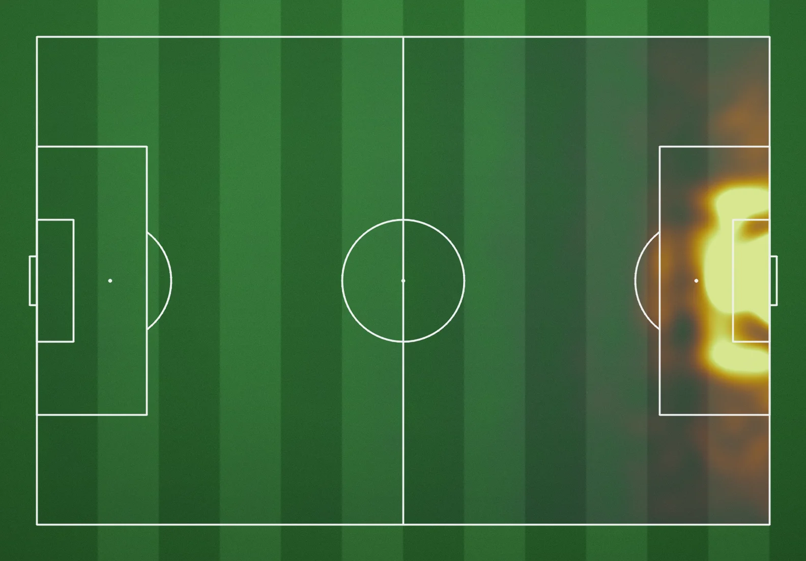
The value surface was where this stopped feeling like database housekeeping. Score every action by expected threat, bin it over the pitch, and a season of Premier League football turns into a picture of where the game is dangerous.
I kept forgetting which metrics ran on all 444 matches and which were stuck on the 64, so I drew myself a menu.
I was slower to understand that events aren't independent rows. They chain into possessions, possessions roll up into the four moments, and every value metric above is reading that chain rather than the individual event.
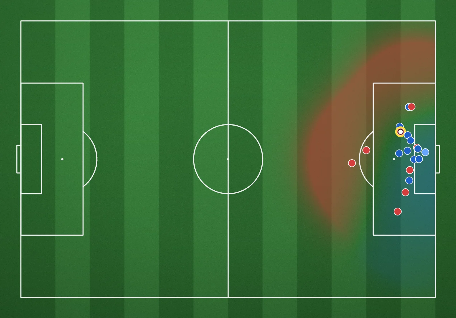
Next I pulled a single freeze frame from the World Cup data. What does 360 actually buy? Give every player the grass they'd reach first, and a still image turns into territory.
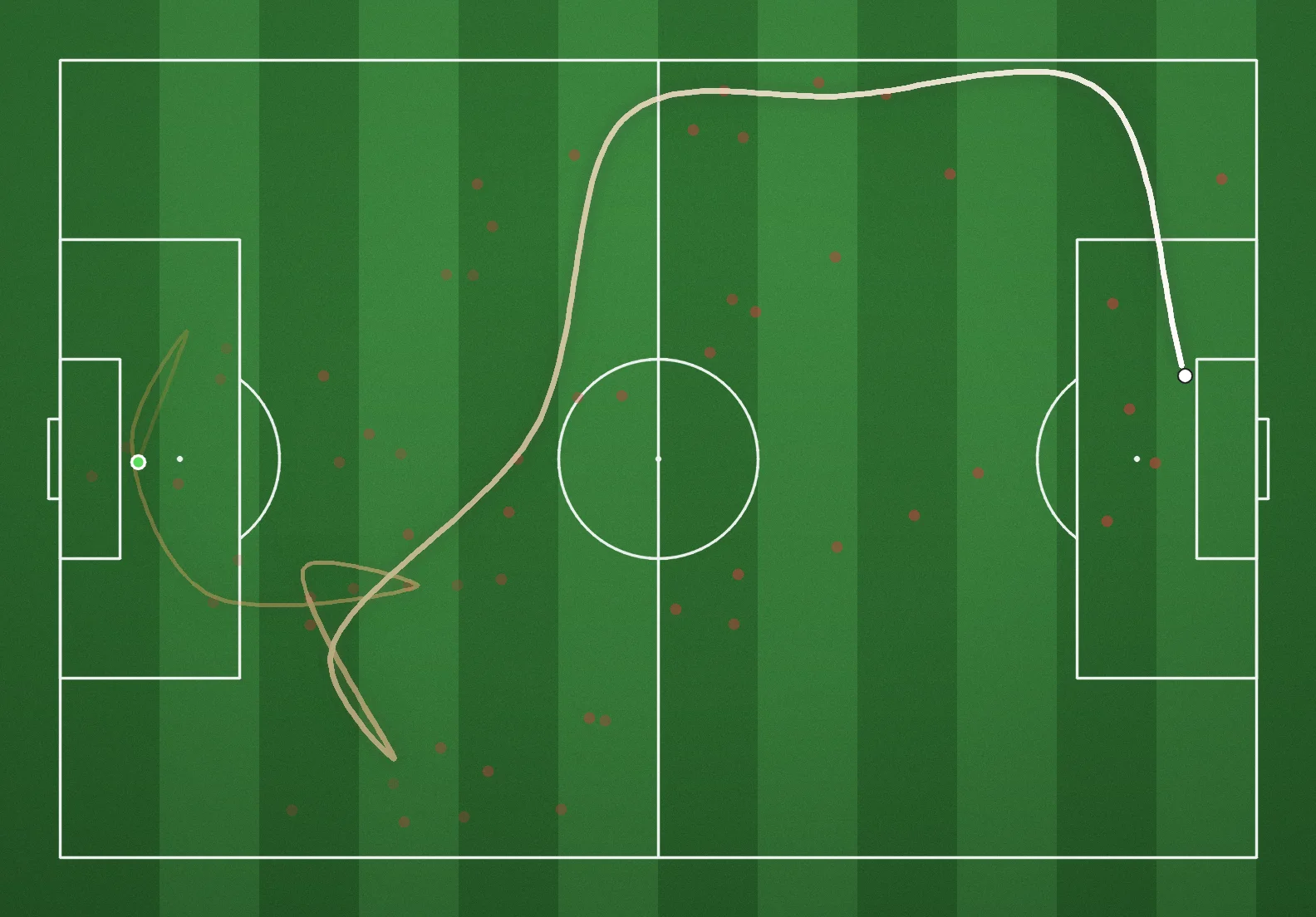
This last one was the most fun to make, especially the little knot near the start that looks like a rendering glitch but isn't. It's the possession structure from Fig. 5 again, but drawn from a real ball trail instead of a schematic — a whole passage of play flattened into one image.
Pictures are fun. They don't settle an argument. Most of the claims I hear on broadcasts are testable against these tables, so I tested them. Each one gets a null, then what the data actually shows.
Is the transition really the most dangerous moment?
Coaches and commentators treat the attacking transition as the phase to exploit.
state_aggregates carries expected goals and seconds per state, so I compare expected-goals-per-second in attacking_transition against organized_attack across 888 team-matches.
Null: the two rates are equal, and transition looks dangerous only because it tends to happen near the opponent's goal, not because it's transition.
Result: the opposite. Organized attack produces 2.49 xG per 90 seconds of its own game time; attacking transition produces 1.47 — about six-tenths as much (paired t-test across team-matches, p < 0.001). Transition still beats either defensive state by more than an order of magnitude Fig. 8, so the broadcast instinct isn't crazy — it's just being measured against the wrong baseline. Held to keeping the ball in a settled attack, transition loses.
Does pressing higher actually shorten the opponent's next possession?
I join pressures — using start_x for pressing height — to the following possession in passes, matched by match and possession number.
Null: pressing height is uncorrelated with how long, and how far up the pitch, the opponent's next possession runs.
Result: barely. Across 53,990 matched possession pairs, press height correlates with the next possession's duration at r = 0.06 and with how far it progresses at r = 0.02 — both technically distinguishable from zero at this sample size, neither large enough to act on. If anything, the most aggressive fifth of presses precede slightly longer opposition possessions (15.1 seconds) than the least aggressive fifth (12.3 seconds). This is event data, so it runs on both competitions; the null effectively holds.
Do wide final-third entries produce better chances than central ones?
team_attacking_strategy_features splits final_third_entries from wide_final_third_entries; I join that to shots and compare xG per entry.
Null: wide and central entries generate the same shot volume and quality.
Result: the null holds. Wide-entry share and xG-per-entry are uncorrelated within noise (r = 0.035, p = 0.29) across 886 team-matches — the most central third produces 0.0214 xG per final-third entry, the most wide third produces 0.0231. The route in doesn't reliably predict the payoff; whatever gets a team into the box matters more than which side it comes from.
Is finishing worse under pressure, or just rarer?
This one nags at me.
Commentators assert it constantly, but it sounds like two different claims wearing one sentence.
I mark a shot as pressured if any opposing pressures event lands in the same possession, then compare actual conversion of pressured versus unpressured shots at matched statsbomb_xg.
Null: once xG is matched, pressure lowers shot count but not conversion.
Result: a small real effect, not a dramatic one. Weighted across five xG bins, pressured shots convert about 0.6 percentage points worse than unpressured shots at the same chance quality. The raw gap — 9.2% pressured, 9.7% unpressured, out of 13,582 shots — doesn't clear a chi-square test on its own (p = 0.29); the effect only shows up once quality is held fixed. Pressure costs a finisher something. It's a smaller something than the commentary implies.
Does progressive passing add anything beyond simply having the ball?
team_attacking_strategy_features holds both possession_share and progressive_pass_share; I regress match xG-difference on progressive share with possession share already in the model.
Null: progressive-pass share adds no predictive value once possession volume is controlled — it's a restatement of having the ball.
Result: mostly the null, with a crack in it. Possession share alone explains 21.9% of the variance in match xG-difference across 888 team-matches; adding progressive-pass share moves that to 22.2% — a small bump, not a rounding error but not much of one either. The raw correlation between progressive share and xG-difference is real and clears significance on its own (r = 0.13, p < 0.001), stronger than the model-based bump alone suggests, but possession still absorbs most of it. Moving the ball forward adds a little beyond simply holding it. Not nothing, but not much.
Does local numerical superiority in buildup convert to progression?
This is different from the free man — it's just raw overload.
free_man_events carries buildup_superiority and downstream_xt; I bucket events by superiority and compare mean downstream value.
Null: buildup superiority is uncorrelated with progression, and bodies alone don't help without the free man the superiority is supposed to create.
Result: it depends on how much superiority. The straight-line correlation across all 89,139 events is negligible (r = 0.004, not significant) — because the real relationship isn't a line. Mean downstream value dips slightly negative at a one-body deficit, climbs through parity and a one- or two-body advantage, then falls back at the largest three-body overloads Fig. 9. A small overload helps. A total mismatch, on this data, doesn't help more.
Does a ball-referenced compactness predict ball recovery where hull compactness does not?
The compactness mistake left me with a better test.
I build the ball-side measure — mean opponent distance to the ball — from freeze_frames, put it and a plain convex-hull area up against the same question, and check whether the defending team regains the ball within eight seconds.
Null: the ball-referenced version predicts regains no better than the naive hull, which would make the distinction conceptual but empirically useless here.
Result: neither version wins cleanly. Mean distance-to-ball is essentially uncorrelated with recovery (r = -0.004, not significant), though the tightest ball-side third of events does recover slightly more often than the loosest (22.3% versus 17.3%). The naive hull area, of all things, shows a small but real positive correlation with recovery (r = 0.05, p < 0.001) — bigger hulls recover more, the opposite of what either version of "compact defense" would predict. Eight seconds and a single 2D freeze frame with no velocity is a rough stand-in for "won the ball back"; I don't trust this test enough to call it settled, but the coach's version didn't obviously beat the spreadsheet's.
And then there's the free man: a teammate with no opponent inside a radius and a clean corridor to receive.
free_man_events already carries reached_free_man alongside downstream_xt, so I compare the two directly.
Null: reaching a free man doesn't raise the value of what follows beyond what the buildup was already generating.
Result: it does, by a wide margin. Events that reach a free man produce 0.00105 downstream xT on average; events that don't produce 0.00029 — better than three times as much (t = 4.31, p < 0.001, 89,139 events). It's the one metric in this whole pile that came straight out of coaching language, and it's also the cleanest result in the batch.
Does losing a player actually change the game, or just the scoreline? Seven dismissals turn up in the lineup data across all 444 matches — three straight reds, four second yellows — each one marking the exact minute a team drops to ten. I split each match's passes and shots at that minute and compare the sent-off team's own numbers before and after. Null: a one-player disadvantage doesn't show up in territory or output at this sample size — seven matches is closer to seven case studies than a dataset. Result: small sample, mostly consistent direction. Pass share falls in six of the seven matches Fig. 10, from an average 41% of match passes before the card to 25% after — the cleanest and most consistent of the numbers here. Shot output falls in five of seven. Expected goals conceded per 90 minutes rises in four of the six chartable cases; the other two were already conceding at an elevated rate before their card, so a one-man disadvantage isn't the whole story for them. Seven cases will not settle this, but the territory loss is the closest thing to a universal finding in the batch.
Every one of these is a read-only query against a single file on my laptop. The data to check what pundits say has been public this whole time. Mostly nobody checks.